

Infographic
This is the first of a multi design project. For each project we have two weeks to finish it.
The first assignment was to make an infographic. This would be great for me since I promised my mom to make an infographic for her.
But before deciding anything I first researched what an infographic was. Infographic is a pretty broad word but means along the lines of:
https://www.dictionary.com/browse/infographic
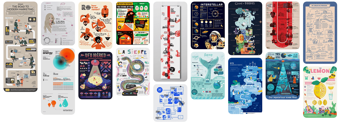
But to get a better idea in mind I searched for examples and saved them in a Pinterest to always have inspiration. The reason I specifically chose those images was because they stuck out for me.
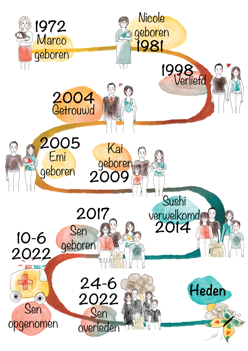
I than chose to make the request from my mother. This request was to make a timetable for a book she is writing. She is writing a story about her life and the loss of my little brother. She wants an infographic showing a timetable of an order of events.
1972 Marco is born in Deurne.
1981 Nicole is born in Belfeld (Limburg).
They meet in 1998 in a Discotheque (Time) in Venray. While dancing. They started dating on 24-12-1998.
In 1999 they live together in Heeswijk-Dinther.
In 2002 they own a house on the Irenestraat. Married in 2004 and honeymooned in Indonesia. Got pregnant there. In 2005 Emi was born. In 2008 on vacation to Greece and got pregnant. In 2009, Kai was born. In 2014 came Sushi 🐈. In 2017 became pregnant with Sen (down syndrome). On 10-6- 2022 bad news and to the hospital (Princess Máxima Center) and on 24-6-2022 death. Today/now everything is slowly looking a little better again.
I will now refer to my mother as a client since she gave me the assignment.
Discussed with my client how she would like to visualize it and gave me references.


I Made an mood/style bord to get an better idea of how the infographic would look.

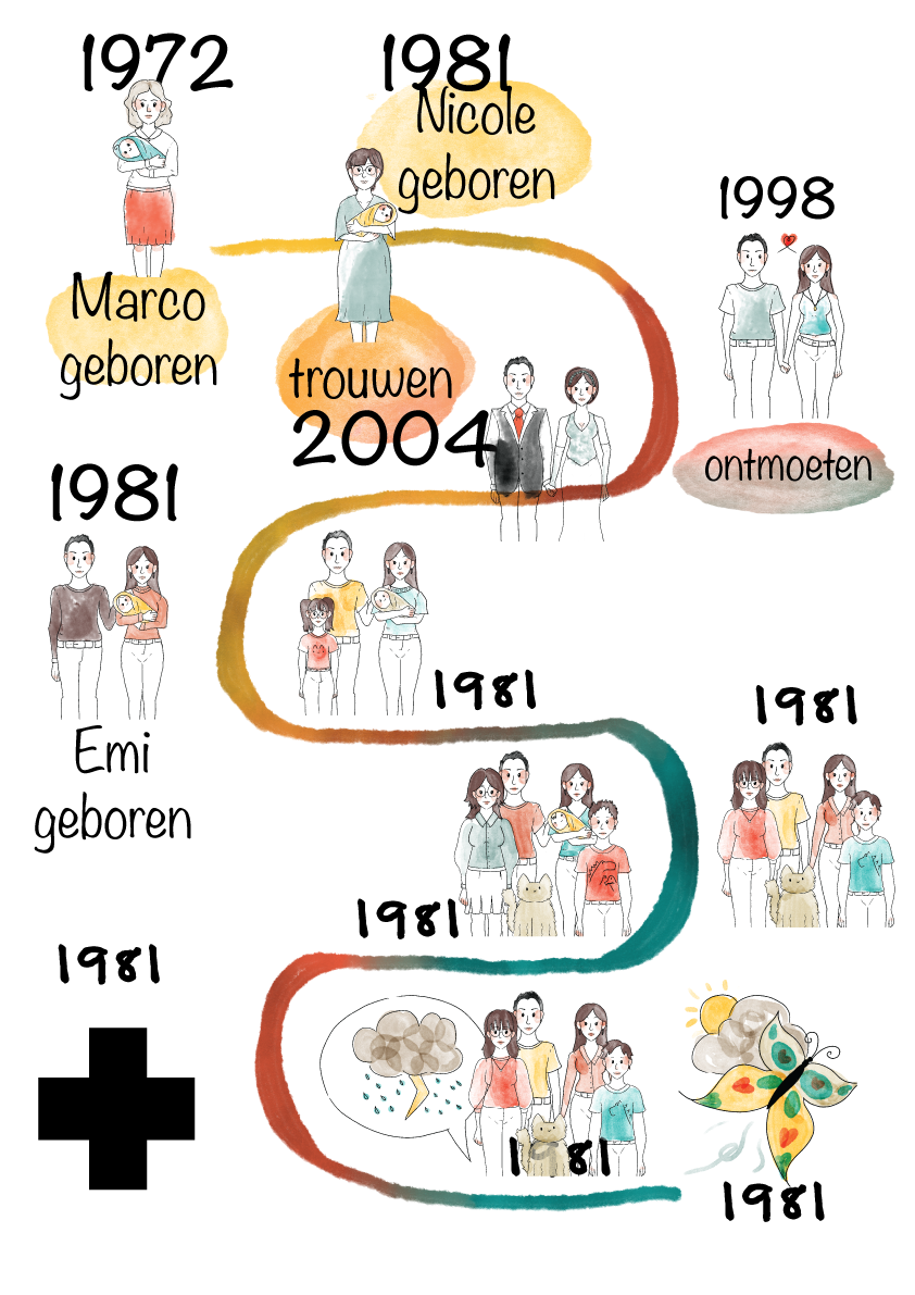
I tried to make some character designs in that style but was never pleased with the look of it. It was difficult to place them in a space. To make each character look unique and just was not happy with the results.


After some discussion with the client and input from my teachers we decided to make a new reference board with a style that we would both like. My client liked a watercolor style and I recommended to choose a not super detailed art style since it would overpower the infographic.

To make it clear for how it would be visualized I made small doodles of how I would show every event. Me and the client also chose a reference that would become the art style. This reference I would evaluate to see if it was too busy for the infographic.


I than started to make each image whilst updating the client of how it looks and making changes because of it.
When there was a feedback conversation with the teacher they gave me the assignment to make a clear sketch of the final product, the location of each image and the space that fills in-between since till that moment I was in the mindset what I would just figure it out.


After I made all the images, I showed them to the client, and she was really positive of how it looked.

Then it was time to make it a real infographic. I fist just made a fancy line to lead the eye. the timeline and placed all the images in their spot. Then I put the year and a small text with it. When I took a step back, I realized that it looked quite bland and was difficult to link the text with the image. Also did I get feedback that the font I used made it look nonprofessional and did not match with the images.

I chose a different font and after showing it to my client she noticed a lot of other things that she wanted to change. She wanted the images to overlap with the line and each character to have the same colors in each image. This meant that I would need to recolor almost every image and add a white background to the character since they were transparent. The client also wanted to change an image and add a whole new image since there was a miscommunication about the timeline. So, I recolored everything.
I also made a test image so see if the client would like it before spending a lot of time to make the real product.


I also added a color splotch to make everything connect more. And with a bit of tweaking of the place of every image. A strategically chosen places for all the text to lead the eye and inserting the real text I got the end product.


I learned a lot from this project. I learned how to collaborate with a client while keeping it in the bound of the assignment. I also learned how difficult it can be to make something in a style you do not like and balancing your wants with the wants of the clients. I like that we got such a short time for this to learn time managing and now making something that you realistically don’t have the time for it. I really liked this project and worked hard to make it the best. For me and for my mom.
-Emi Hiraki 26-4-2024


